Saturday, May 14, 2016

The Apartment

The Apartment” is an animation tI created hat’s explores the human experience of uncertainty. I explore this idea through the first person camera view experience of a character who has woken up in their apartment. The character is not important. The scene is meant to present a universal understanding of uncertainty through confusion in a place that looks real, but as one further explores, they wonder what is reality in a place that seems at first glance familiar.
 
I get my inspiration from many sources. One of my main sources are animated films that I see on television, online, or at the theatre. The first that comes to mind are Pixar films. When I see a Pixar film such as “The Incredibles,” which is an animated film that started my interest into the field of animation, I get a wealth of ideas for animations and scenes that I want to start on my on. Other Disney and Pixar films influence me as well, but that is the one that resonates in my mind. Whether I am working on an animation, video art, or other forms of art such, I find that life influences my work. My job, daily experiences, life goals are all things that speak through my works of art.
 
Time is a big factor in my life, whether it be time management working on a project or running late for something such as work. I have found that lately, the idea of time has had a major influence on what I animate in my projects. In “The Apartment,” the scene begins on the view of an alarm clock going off. It time to wake up! There is this day-to-day battle with the alarm clock. Everyone has had that feeling of wondering whether they have set the alarm or have those weird days where the alarm clock doesn’t go off for some reason and now they are late to something. This is an idea that anyone can relate to, time not being on your side. In “The Apartment,” the scene uses the element of time to explore the idea of uncertainty. As the scene continues, the viewer is left to wonder. Has the person in the scene woken up? Or they sleep walking? Is this dream or reality? I find this an interesting scene to explore because if anyone has ever woken up in that state of mind where things are unclear, sometime one doesn’t know if they have fully woken up. Sometimes dreams are so real they seem like a reality and one doesn’t realize it’s a dream until they wake up. The confusion between the two creates this uncertainty that we all experience in life, in through the scene I hope to convey this message to make the viewer question things that or uncertain in their own lives. Where do we go from here? What path do I take? No one truly knows. It is the path we choose to take that leads us to discoveries along the way in a world of doubt.
 
"The Apartment" Delbert S DuBose Jr, 2016.


Thursday, May 12, 2016

Watch Me Move

         "Music is Me" by Delbert DuBose Jr, 2015.


I wanted to talk about a past project I worked on. In  a project before this one, I created a video project where I wanted to told a narrative about what music is to me. With a new project I  wanted to look at the music in a different way so initially I wanted to do a project about the club experience. As obvious in my last video pieces I love dancing. I originally had the idea to 3-D model a scene of my car driving to the club with the music playing and end up with a video montage of me dancing at the club. What I ended up creating was a video piece that breaks down at the core what I wanted to explore which was my dancing. I followed somewhat of a process or a journey over my pieces. First I told a story about the bay area and what from the area influenced the music and how I respond to it. My second project, Music is Me, let the viewer into my world where they see how important music is to me and how music is reflected in everything that I do. In this new piece I explore music at its core, the way I interact with the music, which is literally just the dancing.


"Global Groove" Nam June Pike, 1973.


                "Club Music" First Interpretation


               "Club Matte" Second Interpretation
 
 
What I attempted to do, other than just dragging and dropping video footage into After Affects, was to use the video I captured over multiple layers to create a dancing motif that references choreography at times and at other times just looks like a group dancing together yet every figure is me. I also went beyond the footage and I used my dancing figure as a silhouette to  get a different effect in the piece. I also was influenced in my work by a video in 1973 called Global Groove. O was drawn in by the duplication of form throughout the video. Repetition and motion guided my inspiration for my video. Overall I just attempted to have fun with the project and see where it took me whether than having an end in mind and seeing what kind of video piece I come up with when I steer away from a narrative. I just let the project guide me.


       "Watch Me Move" Delbert S DuBose Jr, 2015.


Costco Machine

             "Back to the Future Opening Sequence"


Looking at what we have seen there have been many versions of a Gulberg machine. One of the first examples that comes to my mind would be a simple version of a Gulberg machine  found in the opening credits of "Back to the Future.


                                 Gulberg Machine
 
I looked at other examples of a machine as such. In a project I look to create my own Gulberg machine, but in my version I created a Costco Gulberg machine. I start the scene with a time clock that simulates an alarm that starts the machine. As the scene continues it starts a chain reaction that gets all my objects going. I started with simple physics and for now, the most interesting part is the domino effect I have with the radios I created that reflect the radio I use at work as a Supervisor. We learn in contemporary art, that art reflects life. I find that in my art, the experiences I come across reflect in my work. Since I work for Costco Wholesale , I wanted to bring my experience to life. So take the journey through my experience of your local Costco in "The Costco Machine."


                         "The Costco Machine"


A look at Art in the Bellagio

fiori
Fiori Di Como" by Dale Chihuly
One of my favorite places I like to go to is  Las Vegas. No matter how many times I go I always walk through the Bellagio because it's one of the main hotels, but they also have much art placed around the hotel. One of the main pieces that stand out to me in this hotel is the art the assortment of flowers created by Dale Chihuly titled Fiori Di Como, a piece of  art that we see on the ceiling. The flowers are a glass sculpture that looks like a garden of beautifully colored glass flowers that seem to grow on the ceiling of the Bellagio.
Video capturing the sculpture on the Bellagio Ceiling

Chihuly is an artist that has redefined glass sculpture as an art. The sculpture consists of 2,000 hand-blown glass blossoms that weigh about 40,000 pounds. They are supported by a 10,000-pound steel armature according to Las Vegas Journal review. I think its interesting to go beyond how we see some art publicly displayed. We always see art on the wall and sculptors placed on the ground or at eye level. Las Vegas is a city of tourist and much traffic of people gathering around to take in the sights, so for an artist to have viewers in awe of a piece of art that hovers above them. It's something you can't miss. The piece screams to be view with its vibrant colors and each glass flower interacting with another. Also important to notice is the bright lighting also that pulls the viewer into the piece. A sculpture that remains in the mid long after one leaves the city of sin.
                "Through the Looking Glass"


"Through the looking glass is a video I watched discussing his art process with glass. He looks to
push the forms in glass to an organic form that happens naturally. In looking at his glass sculpture at the Bellagio, I like seeing the organic form in the glass as each blown piece of glass becomes a flower. Its something that takes your eye because the sculpture extends the length of the lobby ceiling. You almost would miss it if you didn't look up, but once you do its a sight to see. It's great to see how organic forms in nature can inform different medium especially once such as glass. Glass is a medium that is hard edged and looks sharp, but once an artist such as Chihuly works it, the glass becomes soft and seems to flow over the forms taking glass beyond its original look.


Wednesday, May 11, 2016

Zeitguised


                                   Henrik Mauler

Through my research working through digital media, I have come across the work of the Zeitguised group. The Zeitguised group is a group of artist, designers, and technologists based in Berlin, Germany. I have seen many examples of the work that comes out the group so I have always been interested to know their process in how they come up with the unusual forms that seem to be unique to the aesthetic of the Zeitguised group. In doing my research I actually came in contact with one of the artist that works with them and his name is Henrik Mauler.

                 Geist.xyz: Physical Design Show

                "Whats the Matter": Geist.xyz show
 
In talking with Henrik he mentioned that the background of the  group was in architecture, design, fashion, and sculpture. He had been working for the group since 2001, but has been in the field since 1988. In his work he looks to explore uncharted visual territory, uncanny contradictions, or just finding satisfaction in nice things. I was really attracted to their work because I see a heightened awareness in an attempt to create or discover visual imagery that has not been presented yet. I think overall in the work released from the group, their overall nature is in creating physical forms, objects, and textures, that we haven't encountered and cause the viewer to take a closer look.


                                  "Absolute Amber" Still
                              "Absolute Amber"


                                 "Concrete Chrome"
Artifacts from a perceived reality and abstractions drive the work that is created by Henrik and the Zeitguised group. I think this notion sticks out the most when looking at their work because in much of their work the viewer can see reference to objects from real life, but in the way in which the forms are depicted refer to the objects in the most abstract way which seems to pull away from the original source material as much as possible. The way in which abstraction is used in the work allows for some interesting shapes and forms that seem to be biomorphic in nature and maybe even slightly refer to biomorphic forms in nature. One of the images I remember from past lecture, is the image above with the metallic, reflective material. What really catches my eye with a project such as that one was that the image created is almost that of balloons flying or smoke/ steam that comes from a train both of which emulate a floating type substance or object. Yet what we see before us is materal reminiscent of metal which is something very solid. Something that couldn't possible float. the abstraction of form in this image allows for an interesting juxtapositions of form material and physics in nature.

                                   "Peripetics"

I asked Henrik what kind of projects they plan to work on in the future and he said, "hopefully more interesting ones! There are always lots of interesting fragments, unfinished ideas and plans in the drawer. I really can't say what crosses our paths and minds in the future!" I like that there work uses abstraction break down the forms of objects. It seems like "fragmentation" is an idea that really guides the work. I like seeing artist who can take animation as a medium to explore new ways of looking at things. Animation can be used to create interesting juxtaposition between form, material, shape, and movement and the Zeitguised group uses those attributes well to create unique forms of visual language.

Tuesday, May 10, 2016

Alex Lee: The World Around Us


I had the pleasure of contacting and talking to a new media artist by the name of Alex M Lee. He was born in Seoul Korea. His family moved to the US and they settled in Connecticut. He visits Seoul quite often and finds that Seoul has become "one of the most wired countries in the world."                  


"Darkroom (Hanging Prints)," Computer Drawing. 2009

"Darkroom (Clock and Light)," Computer Drawing. 2010

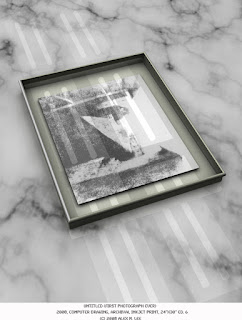
"Untitled (First Photograph Ever)," Computer Drawing. 2008

He is a digital artist that incorporates his art experience around the idea of making images. He began working with analog photography at first, then slowly transitioned to digital as the  photographic field went digital. He explained to me that his process of dealing with photography developed alongside the same time that the industry went digital. He said, " I transitioned to 3D modeling and animation because I saw more possibilities with furthering the discussion of materiality, form, structure, and artifice."

                         Haeshigae (for Proust)

https://vimeo.com/36066402

In talking about his work Alex explained that ultimately he is "trying to come up with imagery that evokes our understanding of the world around us." He uses the temporary tools at hand and the extend of technology to guide his work. His transition from still imagery to time based works was inspired by the possibilities he saw in 3D. This artist grabbed my attention because he gave a lecture on campus and I liked how he used 3D in order to explore the process of image making on the computer. I always like how artist like Alex take different paths to explore different ways of seeing things, but use some of the same material I am familiar with. 


Thursday, April 28, 2016

A look into Life: Bay Area Exhibit


   "Architecture of Life": Berekley Art Museum, 2016


The Berkely Art Museum has a new exhibit I veiwed on Friday, April 22. The exhibit is the "Architecture of Life" which is open from January 31st through May 29th. The museum is located just up the hill with a modern L.E.D. sign letting visitors know the neew museum is there. When you first walk in the amount of open space welcomes you. The museum gives a few pathways in which to start exploring the museum.


Diller Scofidio & Renfro: Hand Holding A Model of BAMPFA, 2012


The exhibit was a show for the new museum. The musems open space leads one into an environment of exploration where there is much open room to walk around the museum and the space was filled with light. The light seemed to illumiate all of the work that was there to view. "Architecture of Life" gives a view into art that examines the way we see the world through multiple themes and conversations created by the art.


Fig. 1: Stephen Kaltenbach. Portrait of My Father, 1972-79


Fig. 1.5: Heather standing in front of Portrait of My Father


There was a variety of works displayed in the large museum from video pieces, scuplture, and paintings etc. The main part of the gallery, on the floor we enter had paintings and mixed media pieces on the wall spaced out giving viewers enough space to view and interact with the work. The first piece to capture my attention was a piece titled "Portrait of My Father," a painting of the artists father experiecing the effects of Alzheimers (Fig. 1, Fig. 1.5) This piece was set out by itself located at the end section of a wall. This painting draws me in first because of the large size of the painting that seems to take up the whole wall. With a step closer I could see all the detail of the painting. What I noticed where these transparent colored nodes that covered the canvas which seemed to me to symbolize DNA with a connection to life and death.


Fig. 2: Hyun- Sook Song. 4 Brushstrokes over Figure, 2012


Fig. 3: Hyun- Sook Song. 21 Brushstrokes, 2007


Fig. 3.5: Hyun- Sook Song .2 Brushstrokes, 2012


John Viewing the Hyun- Sook Song series


This floor was filled with a few installations, video, and 3D animation; but what kept my attention for some reason were the paintings. The paintings all seemed to have their own themes and many of them didn't relate although there were mounted on the same wall. There was once exception. On the wall right before the end of this main area, there was a series of brushstrokes by the artist Hyun- Sook Song. Two of the paintings were of a dark nature (Fig. 2, Fig. 3). The third painting was the opposite, one of daylight. (Fig. 3.5) The three paintings is a discovery of the characteristics of brush strokes on canvas seamlessly connected with symbolizing the background of the artist as a Korean native. I think the series is an interesting exploration in using the texture of the brush strokes to take the viewer into a deeper look and meaning of the painting. These paintings made me think about history, culture, and tradition and the artist brings all these values together with a brush stroke. The symbolism I see in the approach is how a paint brush can be used as a tool for narrative. The conscious choice to place these images before the exit of this gallery space draws the viewer in once more just as it drew in another viewer John (Fig. 4). We both had the same actions as beginning to exhit this space, but stopped to gaze at this series for quite awhile analyzing its content.


Fig. 5: Tomas Saraceno. Solitary, semi social mapping of ESO-510
613 connected with intergalactic dust by one Nephila calvipes- one
week- and three Cytophora citricola- three weeks 2015


     Fig. 5.5: John Security for Saraceno's Sculptures


              Fig. 6: Tomas Saraceno. Solitary, 2015


             Fig. 7: Tomas Saraceno. Solitary, 2015


            Fig. 8: Tomas Saraceno. Solitary, 2015


Fig. 9 : Andy and Allison viewing Saraceno's spider sculpture


 Andy and Allison viewing Saraceno's spider sculpture


I think overall what worked for the museum was its overall open space. Although the space was very open, the setup of the museum allowed many passageways to view the art displayed around the museum. It also allowed ways to wrap back into itself as a constant pathway as I found myself coming back into certain spaces from other sides causing me to take a second view and notice something I didn't notice before. A good example of this was the installation by Tomas Saraceno. (Fig. 5, Fig. 5.5) This installation was located in a dark area down a small hallway, you enter into this space that the only source of light is the light illuminating the spider sculptures. (Fig. 6, Fig. 7) The room is very dark which draws in the detail of each spider web. Each one of the four in the series is different. The installation speaks to the natural designs of art that we overlook in nature. I find the choice to place these sculptures in a dark room where the light only shows on the sculptures allows a look where we focus just on the dynamic pattern of line that we see in each spider web. (Fig. 8, Fig. 9) I'm not sure which one, but it's interesting to know that some of the sculptures in this series, the result, was obtained by rotating the box over time. 


Fig 10: Noriko Ambe. A piece of Flat Globe Vol. 12, 2010


Fig 10.5: Noriko Ambe. A piece of Flat Globe Vol. 22, 2010

 
        Fig. 11: Ruth Asawa.. Untitled, 1962

The only thing that I think took away from the overall view of the museum was the lower floor. The upper floor seemed more interesting to me which makes since seeing that is the floor that we enter when we go into the museum. The lower floor had very few interesting pieces of art. I felf that the space was a little bit more dim and it didn't feel as open as the upper part of the museum which allowed for a more open viewing experience for the works. The space you enter into the bottom had much empty space and only had a couple of 3D works that made me want to stop and analyze such as the 3D prints (Fig. 10, Fig 10.5) and the brass wire sculptures (Fig.11). I feel that this space wasn't as immersive as the upper floor. I feel like more of the video pieces would have helped to keep the interest of the viewer while spending time on the lower level.

According to the introduction placed on the wall of the main part of the exhibit, "Architecture of Life is a poetic excursion. It presents revelatory images and objects that stimulate reflection on our own experiences of life through the lenses of structure, location, and imagination." I feel that this exhibition was well put together. The museum had many works to offer the viewer that created a conversation on life and how we see things that we may come across along that journey. The museum brought together a great mix of artist that opened up a range of thought that allows us to see things differently.


Wednesday, April 20, 2016

Containing Content

 
                 Matt Sloan
 
I attended an exhibition in the Witt Gallery on the Sacramento State Campus Tuesday April 20. The exhibition showed the work of Matt Sloan who is an artist which works in hand built ceramics. I have actually seen his work before, but it seems like with his further exploration of form, his pieces seem to become more developed.
 
                            Ceramic Bowls
 
                    Close up of Ceramic Bowls
 
                                 Bowl detail
 
              Ceramic Pot
 
The exhibit in the Witt Gallery showcased a diverse assortment of his work pieces. The pieces ranged from cups, to bowls, slabs, and pots. Looking at his work I can see that his process deals with an exploration in form. It is evident in his pots that a specific decision was made to show seams to break up the surface of the pot. I noticed that a lot in his work, that Matt works with different ways of approaching the surface of his pieces through, the build up of form, the texture, and the glaze he decides to use on each piece.
 
                             Ceramic Cups
 
                       Ceramic Vessels/Jars
 
 
I was lucky enough to visit the exhibit while the artist was there and he discussed that history informs his work. He tries to, "take something you've seen before and make it your own." I like that he said that because in m background with hand- built ceramics, there is a reference to historical vessels and other art pieces when we create our own ceramic pieces. He also mentioned that he primarily uses clear glazes in his work and tries to make something happen.
 
                Scott Parody Ceramic Professor


           Kyle student looking at ceramic slabs
 
Scott Parody, a former ceramic teacher I have had, was also present during my walkthrough of the exhibit. His class was present to come look at Matt's work.  What I noticed throughout the pieces I viewed was his attention to detail in the surfaces of the ceramic pieces. For example in the image above, he etched designs into the slabs before they were fired. That process along with using slip in order to prevent a glossy finish allows the viewer to see how the surface interacts with the etching. A glossy finish would have over powered the work in my opinion. I think the artists decisions in whether to create a glossy surface on the ceramic pieces or keep the surface clearer brings his work together to create an interesting display on the possibilities of what one can create with clay. each step of the process is essential to the finish piece that one comes up with and the experience of working with clay is evident in his work.
 
 
                       Student viewing the work
 
 
        Matt Sloan and his pot
 
What was interesting was seeing how other students reacted with the work. At times students are not able to interact with the art displayed in the gallery. With this ceramic exhibit students were able to get close to the work, touch it, and feel the medium in their hands. It's something more to appreciate when a ceramic piece is in your hand. After it has been fired and glazed and you get to feel the weight of the object and the texture run along your fingertips. I also like to do that because it allows a closer view to the form of each individual piece. The exploration aspect of the exhibit was interesting to see as shown above, one student got close enough to touch the pots and I could carefully see him exploring the texture of the surface. I, as well as the student above, was drawn in by the precision of the artist hand in his work to bring his ceramic pieces to a great ceramic series.


Wednesday, April 13, 2016

Music in Painting


             Mike Henderson


I attended a lecture at Sacramento State April 12th for the artist Mike Henderson. Henderson is a musician, painter, and filmmaker. Art was something that he new he wanted to do. He quit school at sixteen and went back to school to get his high school diploma when he turned twenty one. The artist grew up in Missouri then he traveled to California later on to continue his art studies. Mike Henderson said that he always had a sketchpad with him. Earlier in his life Henderson worked at a shoe shine stand and he painted when he didn't have any customers.


            Earlier Paintings


Mike Henderson first saw abstract paintings at the Van Gogh show in which he saw examples of paintings such as work by George O'Keeffe.  When he first began painting he only had two colors blue and white oil paints. He learned to paint at the Art Institute of San Francisco. He began to paint scenes of the surrounding areas of San Francisco. Through his earlier paintings, he explored colors and how they interacted.


Painting of Columbus and Union St

      Painting doubt of religion

The artist then began to paint things that he liked people doing. Henderson was a musician and many of his paintings reflected his musical background. He painted scenes with music and bands. The artist began to doubt religion. He didn't like the idea of "praying to a white Jesus." He didn't like the way life was set up in California in which African Americans dealt with the issue of turning the other cheek. He felt that suffering wasn't something that he was meant to do.


              Painting shapes
The next progression in his work led him down the path in which he painted shapes. He believed that you can learn to paint anything with four basic shapes. These shapes can be found in nature. He also saw these shapes in space. During this period in time was around the time we landed on the moon. He attempted, during this process to use different tones of grey to get more color into the painting. Through each painting, the artist also tried to work on something technical such as space, working on the figure from left to right, and challenging what was comfortable.

       The Chair as a metaphor


        Trash can as metaphor


The artist also went through a style where he began to create art from found objects. Cutting holes in the canvas, burning it in the oven, and adding water to the canvas. He used different materials to create a sort of collage with his art materials. After awhile he started to miss the brush in his hand. He started to use the chair as a metaphor for heavy conversation. He also used the trash can in his paintings as a metaphor. The trash cans symbolized, "to get to something, you have to go through something." He painted the human situation and personal life experiences through the painting of common day objects he saw around him. Such as with the trash cans, those are things he saw every day were the trash cans and the homeless. He felt you can tell much about a person by what they throw away in the trash cans and the condition in which the trash cans were left.


              Color as sound

Mike Henderson always considered himself exploring through his art. He never wanted to paint the same thing. Everything had to be spontaneous. He always considered doing something on a piece of paper before he entered a canvas. The artist also explored different sizes of canvas because he felt the size of the canvas effected how the artist applies paint to the canvas. Color guided much of his work and later on in his career, he began exploring painting color as sound. The image above is a painting he did when he moved to Oakland. The many uses of color reflect the sounds of the crowd in Oakland. This was his process of getting back into the flow of painting color. Through his work Henderson always tried to "figure out who I am?" He also stated, "working through the arts is a good way to find out who you are." That last quote really stuck with me at the end of the lecture because while we create our own art we are trying to figure out what our art is saying about us or about the world. Our art stands as a symbol to tell the viewer who we are and what statement we want to make through that art. Art can be influential if that's the intention and we hold the power to say something with the art we make.